Portfolio

A selection of work for real businesses, real budgets, and real results
Full brand identity system for Eastside Eats, a Syracuse-based restaurant

Yapture

Full Brand Identity — Syracuse, NY

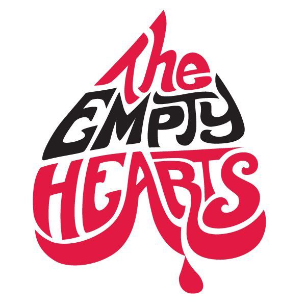
Brand Design for The Empty Hearts

The Empty Hearts

Brand Design & Logo – Rochester, NY

Event poster illustration for Buffalo Arts Festival featuring hand-drawn characters

Buffalo Arts Festival

Illustration & Poster — Buffalo, NY

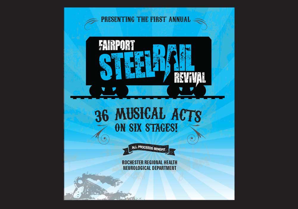
signage design for fairport steel rail festival

Fairport Festival

Storefront Signage — Monroe, NY

Gabe's Pride Cleaning in upstate New York

Gabe’s Pride Cleaning

Brand Logo

Full brand identity system for The Hemp Project

The Hemp Project

Full Brand Identity — Syracuse, NY

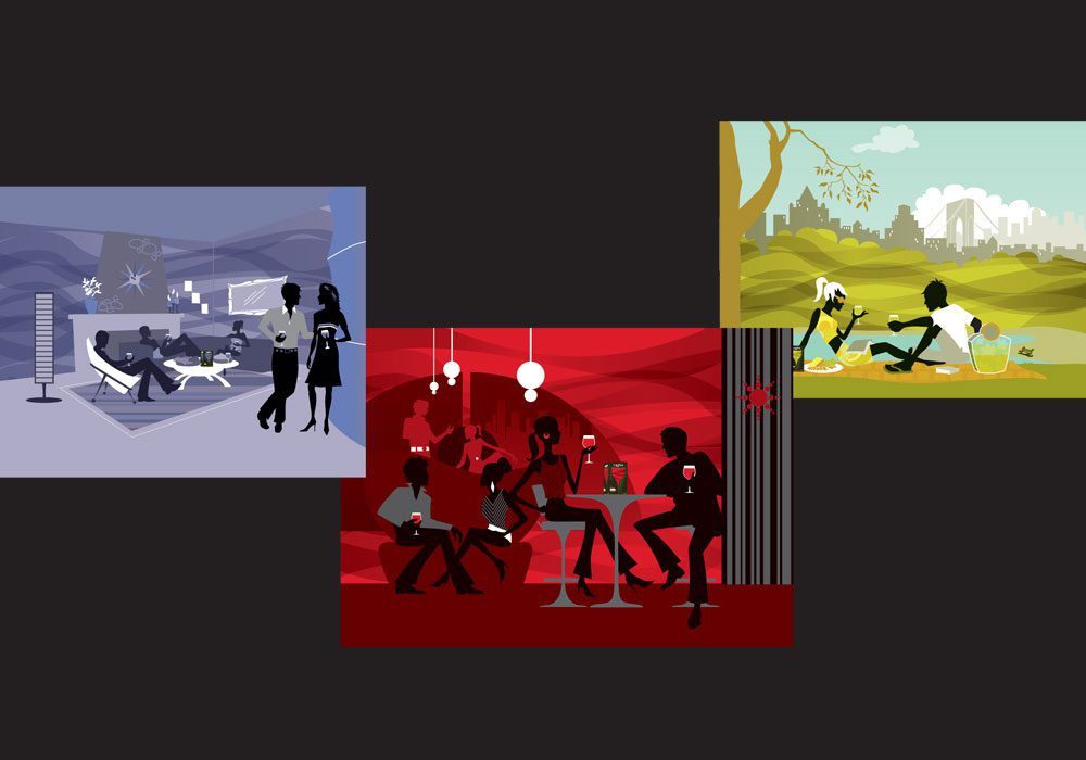
Playful wine illustration

Wine Illustration

Character Illustration

Logo design for Worboys Painting

Worboys Painting

Logo Design — Honeoye Falls, NY

Logo design for the city of Rochester

City of Rochester

Illustration – Rochester, NY

Stickler Audio Logo

Stickler Audio

Logo Design — Upstate NY

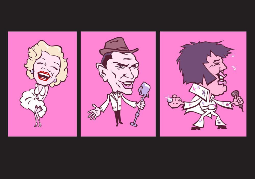
Illustration for Restaurant

Vegas Characters

Restaurant — Buffalo, NY

Minimal logo design for a small hospital based in Auburn, New York

Community Hospital/h3>

Logo Design — Auburn, NY

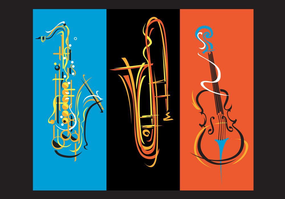
Illustration for a music store in upstate New York

Eastman Music

Store Display

Middle Finger moonshine in upstate New York

Middle Finger Moonshine

Brand Logo

Craft Brewing Company in upstate New York

Craft Brewing Company

Brand Identity

Case Study

The Empty Hearts: From zero to hero

The Empty Hearts needed a logo before the band had settled into any kind of visual identity of its own. Four established players, four very different histories already attached to their names, and a debut record built on fifties rock and roll and sixties garage energy. The brief: something that could hold up on a record sleeve and a T shirt without borrowing from any of their old bands.

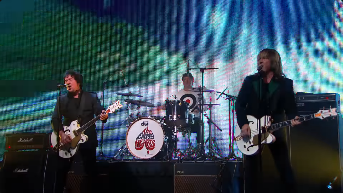
Design started at typography, not imagery. Early sketches used bold, condensed lettering, closer to a hand-painted concert bill than a modern logotype. The palette settled on black and a single warm red, no gradients, no secondary colors, just enough contrast to survive a one-color print run on merch. A rounded heart mark was built as a separate icon from the wordmark, so it could scale down to a guitar pick or a patch without losing its shape.

Usage splits in two. The full lockup, wordmark plus heart, runs on the album cover and the website. The heart alone shows up on picks, patches and the drum riser. Same red every time, whether it’s on vinyl, screen printed on a shirt or lit up on a stage backdrop.

Logo Design Brand Identity Signage Syracuse, NY
Brand identity case study: complete brand for the rock band The Empty Hearts Brand identity case study: complete brand for the rock band The Empty Hearts

Want work like this for your business?

Tell me what you need. It starts with a conversation, not a contract.

Get a Quote