
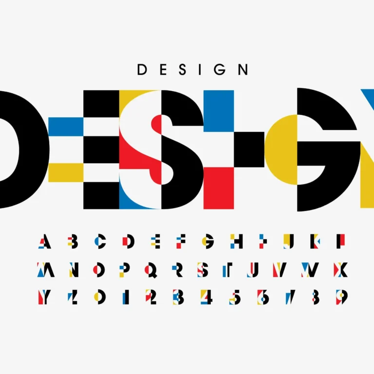
Typography: The Art of Choosing the Right Fonts
Typography plays a crucial role in design, shaping how your message is received and perceived. Whether you’re creating a website, social media graphics, or branding materials, choosing the right fonts can make or break your design. For new graphic designers using tools like Canva, understanding typography principles can set you apart and elevate your work.
Why Typography Matters in Design
Fonts do more than just display words—they evoke emotions, establish hierarchy, and improve readability. The right font choice can make a brand feel luxurious, approachable, modern, or traditional. By understanding font selection, you’ll create visually appealing designs that resonate with your audience.

How to Choose the Right Fonts for Your Design
1. Understand Font Categories
To choose the right fonts, you need to understand the basic categories of typography:
- Serif Fonts – Traditional, elegant, and often used for printed materials and formal designs (e.g., Playfair Display, Merriweather).
- Sans-Serif Fonts – Modern, clean, and commonly used in digital design for readability (e.g., Open Sans, Montserrat).
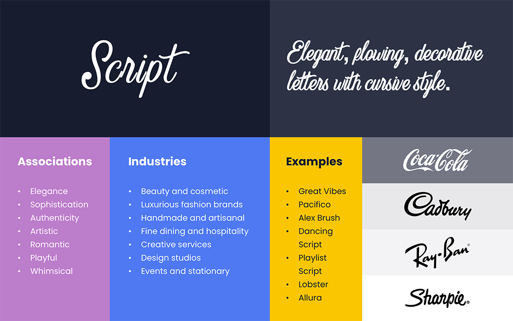
- Script Fonts – Decorative, handwritten styles that add personality but should be used sparingly (e.g., Pacifico, Dancing Script).
- Display Fonts – Bold and eye-catching, used for headlines or branding elements (e.g., Lobster, Oswald).
2. Consider the Psychology of Fonts
Different fonts trigger different emotions and perceptions. When selecting fonts, consider what feelings you want your design to convey:
- Trust & Professionalism – Serif fonts like Times New Roman or Georgia.
- Modern & Minimalist – Sans-serif fonts like Lato or Roboto.
- Friendly & Approachable – Rounded fonts like Poppins or Quicksand.
- Elegant & Luxury – Script fonts like Great Vibes or Playfair Display.
3. Stick to Font Pairing Best Practices
Combining fonts can enhance your design, but poor pairings can make it look chaotic. Here’s how to pair fonts effectively:
- Use a contrast strategy – Pair a bold display font with a subtle body font (e.g., Bebas Neue for headers with Open Sans for body text).
- Stick to two or three fonts – More than that can create inconsistency.
- Match personality and purpose – A playful script font doesn’t mix well with a corporate sans-serif.

4. Ensure Readability and Accessibility
No matter how stylish a font is, if it’s hard to read, it won’t serve its purpose. Follow these readability tips:
- Use proper line spacing – A good rule of thumb is 1.5x the font size.
- Choose high-contrast colors – Light fonts on a light background are difficult to read.
- Avoid overly decorative fonts for body text – Keep script and display fonts for accents.
- Check accessibility standards – Tools like WebAIM help ensure legibility for all users.
5. Use Google Fonts for Free, High-Quality Typography
Google Fonts offers a vast library of free, high-quality fonts perfect for digital and print design. Some of the best Google Font combinations include:
- Montserrat & Open Sans – Clean and professional for business websites.
- Lora & Roboto – A mix of classic and modern for blogs.
- Playfair Display & Source Sans Pro – Elegant yet readable for branding.
- Poppins & Lato – A friendly and modern combo for startups.
Explore the full library at Google Fonts.
Common Mistakes to Avoid When Choosing Fonts
- Using too many fonts – Stick to a maximum of three fonts per project.
- Ignoring hierarchy – Headlines should be larger and bolder than body text.
- Neglecting mobile readability – Make sure fonts are legible on small screens.
- Overusing script fonts – They look stylish but are often hard to read.
- Not considering branding consistency – Fonts should align with the brand’s personality and values.
Where to Learn More About Typography
Want to dive deeper into typography best practices? Check out these resources:
- Google Fonts – Free font library with pairing suggestions.
- Adobe Fonts – Premium fonts for creative professionals.
- Typography Handbook – A comprehensive guide to typography principles.
Need Help with Your Website Typography?
Choosing the right fonts is just one part of great design. At Mod Communications, we specialize in creating beautiful, high-converting websites with typography that enhances your brand. Let us help you build a brand that stands out.